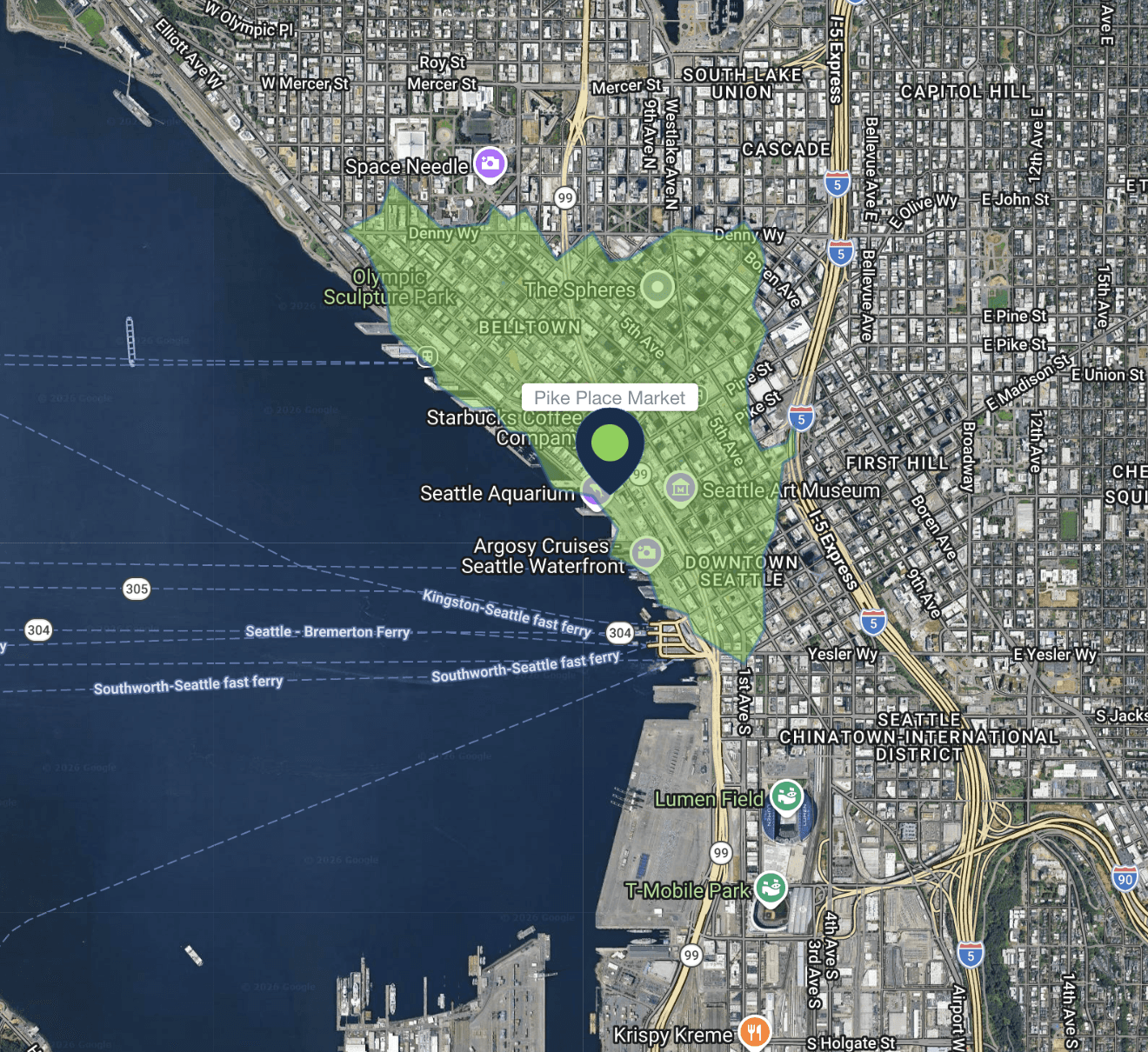
Learn how to interpret and use Population Explorer’s Population Density Map to identify concentration patterns and guide ASB-based decision-making.
Overview
The population heatmap in Population Explorer (PopEx) provides a quick, intuitive way to understand how people are distributed across any landscape. It transforms raw demographic data into a visual surface — a gradient of color showing how population clusters and disperses across space. For users working in site selection, franchise expansion, sales territory optimization, telecom coverage, it can help to approximate consumer volume relative to locations, estimate population coverage of service points, or create franchise territories balanced to underlying population. Humanitarian response teams can quickly spot vulnerable population hotspots and program a response.
Unlike static census tables, which show population totals by administrative units, the density map gives you a continuous view of population intensity. Behind the scenes, PopEx draws on high-resolution gridded datasets like LandScan and WorldPop, each cell representing an estimated number of people per square kilometer. These datasets are derived from census data, satellite imagery, and land-use models, providing a real-world snapshot of where people actually live this year.
This visual approach creates a fast “spatial intuition” for your area of interest. High-density zones highlight potential customer concentration, network demand, or humanitarian vulnerability. Low-density areas reveal gaps in coverage, untapped markets, or sparsely populated regions where expansion may not be viable. For many PopEx users, the density layer is the starting point — a way to visually confirm that population is distributed the way the numbers suggest before moving into more focal site investigation processes.
Why Density Matters in PopEx
In PopEx, ASB results — the population, density, and income outputs shown in the item summary panel — are built on top of this same gridded density model. Viewing the density map directly helps you interpret these values spatially: instead of only seeing a total, you see where that total comes from.
This linkage between density and ASB data is especially useful for identifying optimal locations and boundaries across our analytical hubs:
In Retail and Franchise Site Selection, density helps pinpoint trade areas with sufficient local population to sustain stores or service points.
In Sales Territory Mapping, it helps ensure equitable workload distribution across reps and territories.
In Telecom Site Mapping, it reveals where signal coverage aligns or misaligns with population clusters.
In Humanitarian Response Planning, it helps prioritize deployment of humanitarian aid where people are concentrated.
Because PopEx’s density maps derive from annually refreshed datasets, they also show urban expansion and settlement growth over time, helping planners compare snapshots year over year.
How to Use the Density Map
Open Layers Panel
From the map viewing pane, click Layers → Settings. Under Population, choose the year of LandScan or WorldPop you wish to review.Adjust Visibility
Ensure the Population Density layer is toggled on. You can pan and zoom across the map to view global through local scales.Interpret Color Gradients
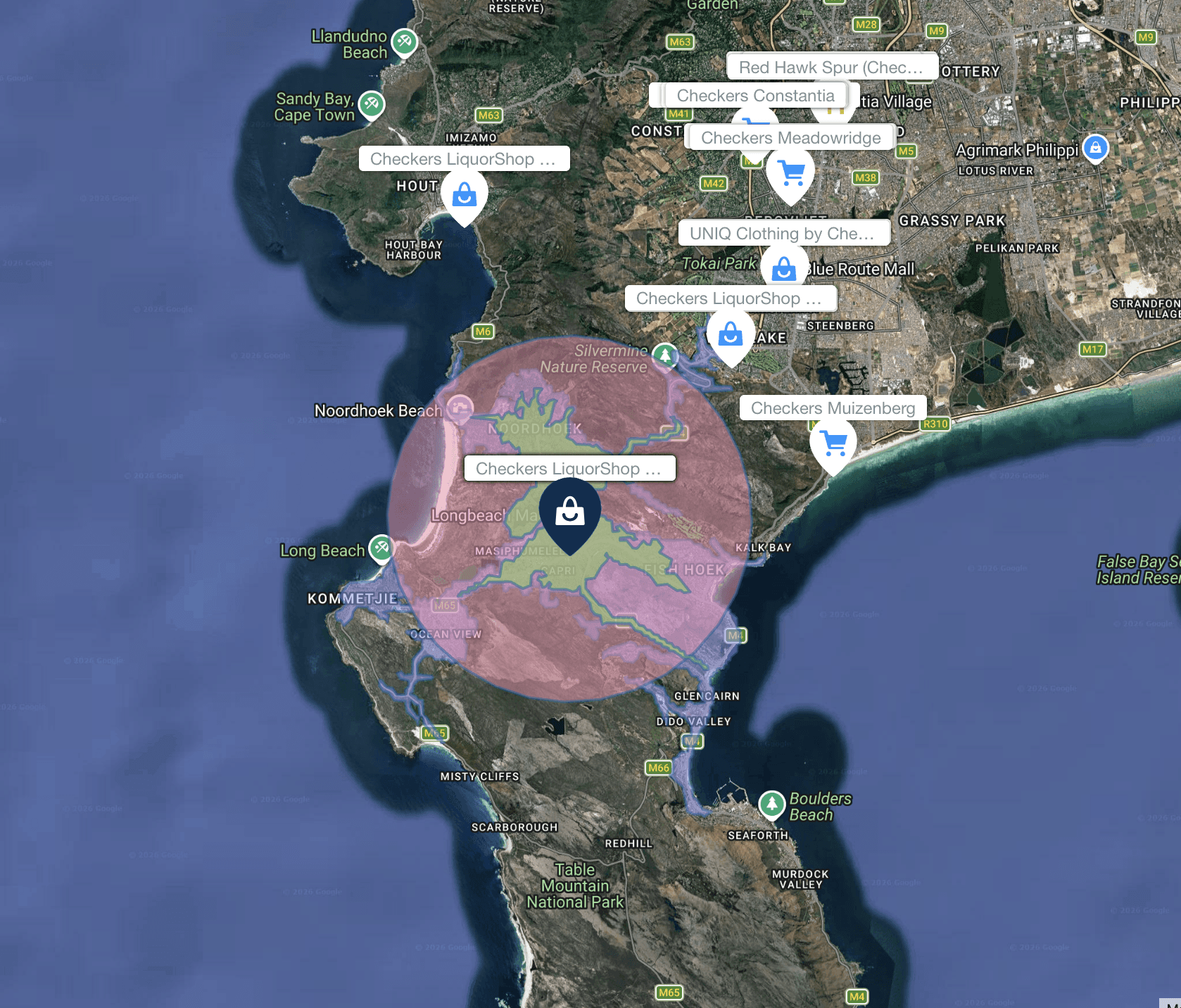
Darker or warmer tones represent higher population density. Use these patterns to identify natural clustering (urban centers, corridors, towns).Combine with Boundaries or Buffers
Activate Administrative Boundaries or your own Custom Items (folders, polygons, or isochrones) to compare where high-density cells fall relative to your selected geographies.Capture Insights
Once your target area is visible, click or draw a new item to begin ASB analysis. PopEx instantly computes totals from the same density grid, ensuring visual and numeric consistency.
Interpreting the Map
High-density zones (deep red or purple) signal areas of strong population concentration — ideal for commercial targeting, service coverage, or aid distribution.
Medium-density zones indicate peri-urban transition areas, often ripe for expansion.
Low-density zones highlight rural, agricultural, or open terrain, often requiring different logistics or service models.
Next Steps
Need More Help?
If you run into issues, please contact us.
Explore our latest thinking on franchise territory design, retail site selection, and the population data that powers smarter location decisions.

Jun 26, 2026
The Cornfield Effect
The cornfield effect is a systematic error in demographic analysis that occurs when census data attributes population to uninhabited areas (e.g., farmland, parks, industrial zones) within a census boundary. This distortion leads to overestimates of customer density and misguided location decisions with notable, negative impacts on franchise territory design and retail site selection. Constrained population models, such as WorldPop Global 2, eliminate the cornfield effect by assigning population only to areas where human settlements have been confirmed to exist.
May 22, 2026
You Can Create a Franchise Territory in Less Than 2 Minutes
Franchise territory mapping no longer has to mean expensive consultants, complex GIS software, or weeks of setup. Modern tools let franchisors create, evaluate, and compare protected territories in minutes.
May 22, 2026
At What Point Does a Franchise Need Territory Mapping?
Not every franchise needs rigorous territory mapping on day one. But once territory decisions begin affecting franchise sales, market protection, expansion planning, and long-term network value, the stakes change quickly.